Your personal transcribing service…
Workflow
When I design an interface I like to get as many ideas as I can out there on the board. So although there are color palettes and typographies that I initially decide to go with, those ideas can change throughout the design process.

Wireframing
When conceiving a project, I like to start with wireframes that outline the main functions of the product. In the case of Subeo, the wireframing process was a blend between low to high fidelity. Taking inspiration from other competing/non-competing services, I wanted to create something that was unique to the brand.


The Blueprints


High-Fidelity
Now that the base for the design has been laid out, I decided to move into high-fidelity design.


Introducing Dark Mode
Although the initial idea was not to make Subeo a dark themed website, the idea became more attractive throughout the design process for a few reasons:

With these considerations, we felt that a dark-themed mode was the direction we wanted to go. However, we will still most likely provide a day-themed mode for users who prefer it.

Illustrations
Making illustrations has always been something I enjoy doing and like to incorporate them where I can in my UI. I like to sketch out my designs on paper taking inspiration from other designs I see online. I try my best to create illustrations that best represent the content.

Subeo (Current Iteration)
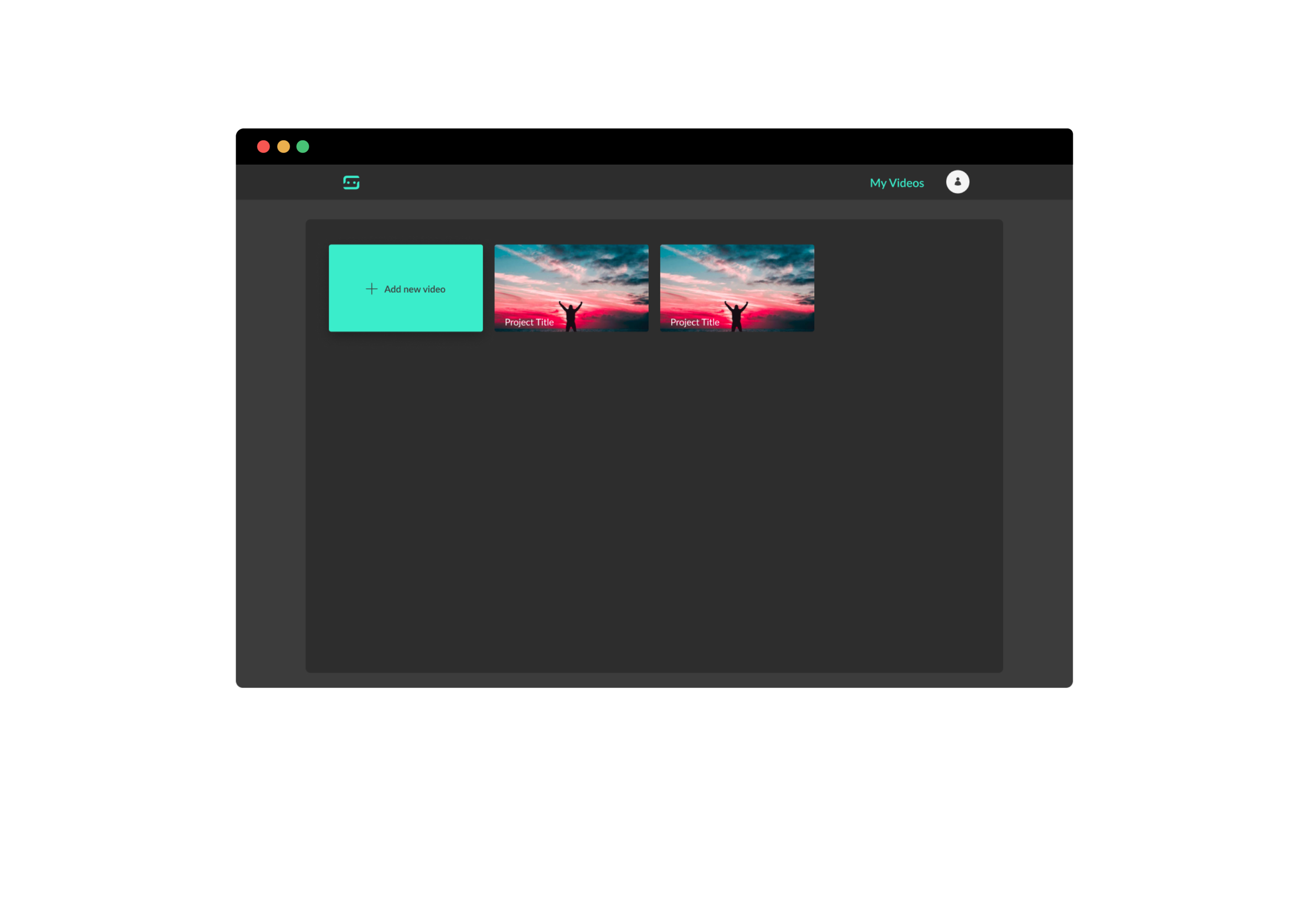
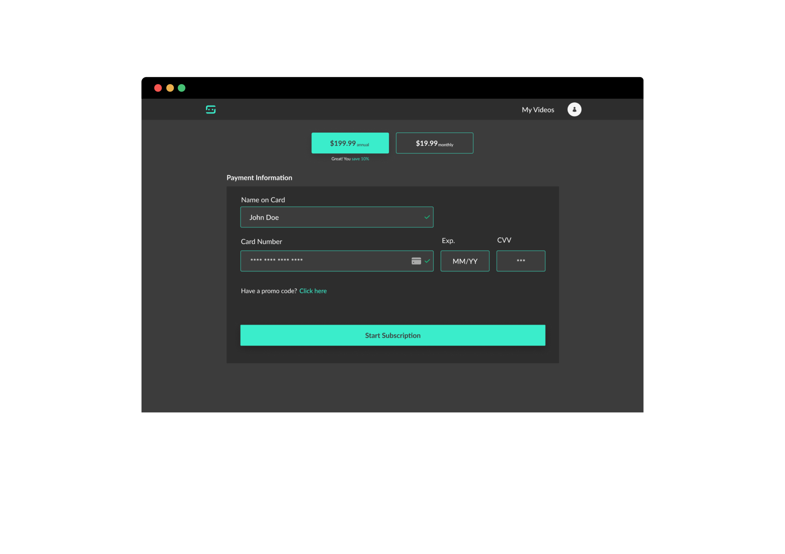
With the illustrations completed, I am now able to build out a high-fidelity design that is visually appealing. Below are the main-components in high-fidelity format.




Moving Forward
With the majority of Subeo’s UI now built out, the product will be developed and will begin going through user tests.
