Mednow
UX/UI Design
The pharmacy that runs to you
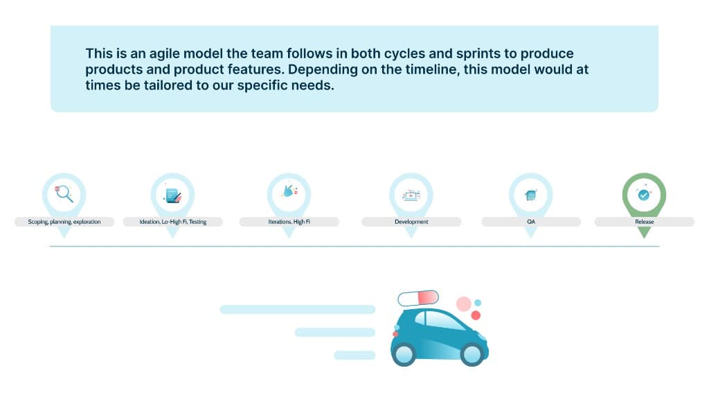
Our Process
UX/UI Audit
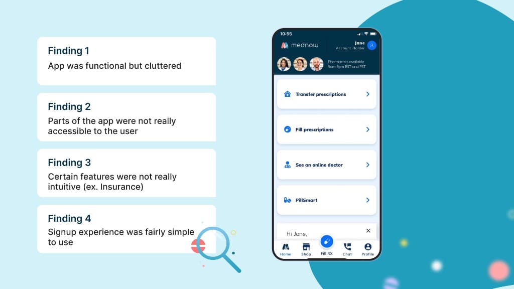
When I was first brought on to the team, I took some time to learn about the existing app that was made by a contracting party. Identifying key UX/UI strengths and weaknesses that I could in turn use to build a better product.
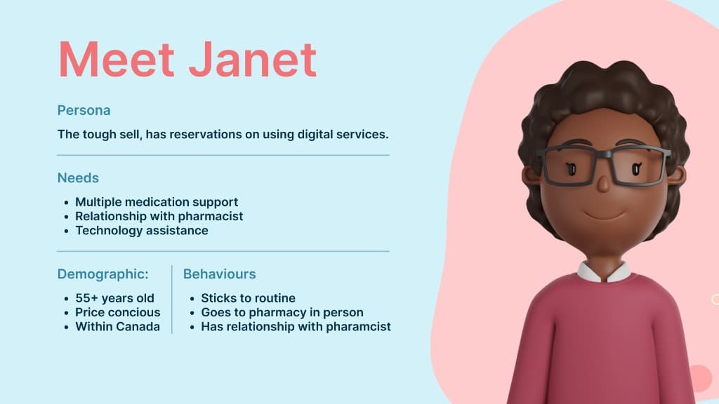
Our End-User
In order to build a good user experience, it's important to understand who our users are. The product team and I took time to research and understand who our user is which in turn made our design process a lot smoother overall.
Feature Work
Now that we have established context, below is some of the feature work I had the liberty to be a part of and take lead on several design initiatives.
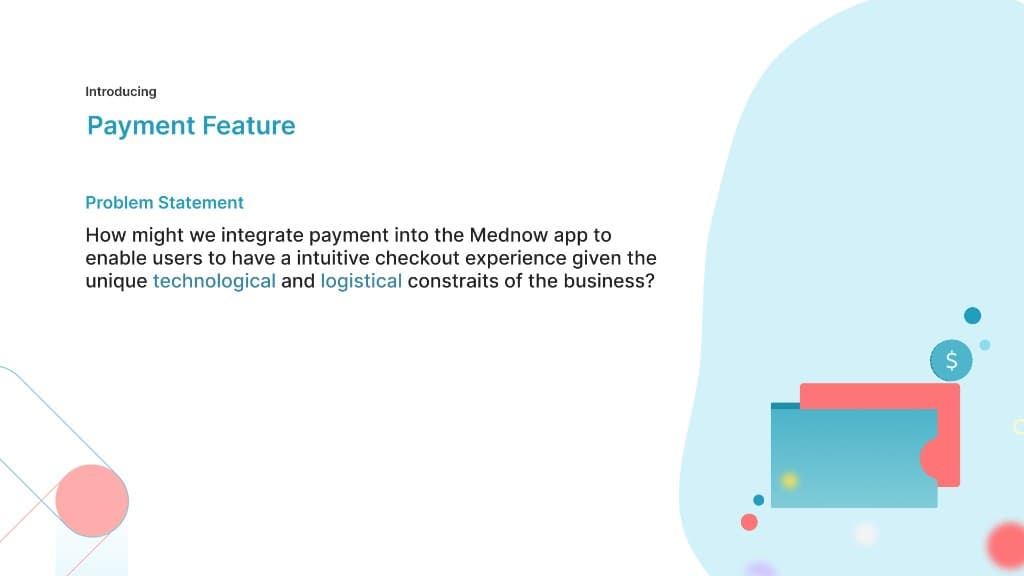
Feature Work
Now that we have established context, below is some of the feature work I had the liberty to be a part of and take lead on several design initiatives.
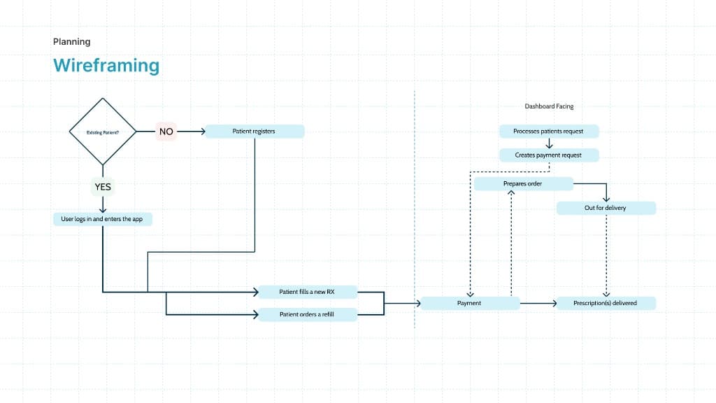
Mapping things out
Before getting into any visuals, it's important as designers to outline the user flows and journeys that the user will take to get to your experience. This ensures that when you do invest time into actual visual designs that you have a more efficient process since the designs will be more intentional.
Introducing Low-Fi's
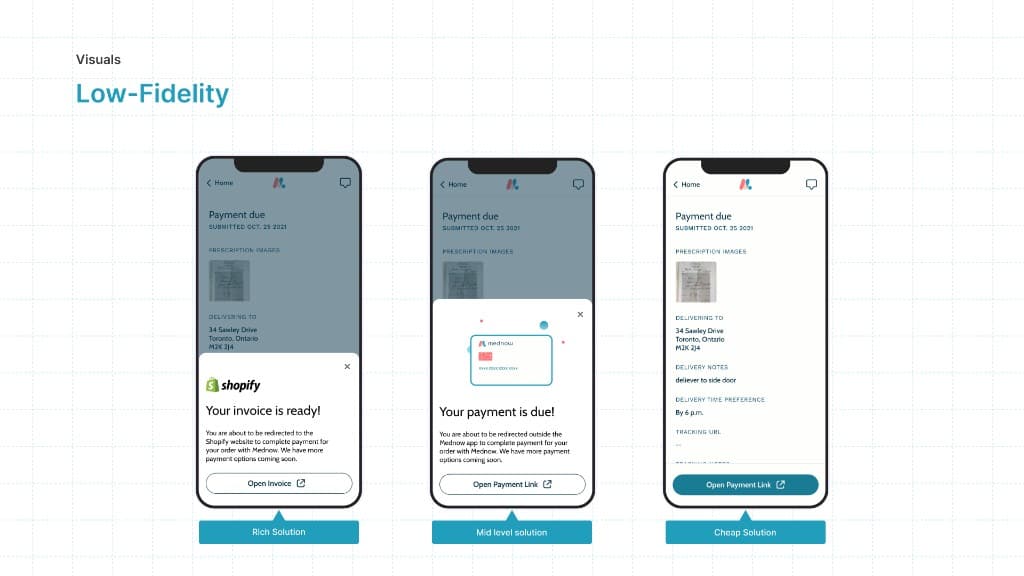
Once the product team and stakeholders were happy with the established user paths, we began creating low-fidelity designs of what the payment feature could look like in the app. We create multiple iterations to gain feedback on and to a/b test with.
Gaining feedback
Once the team was happy with the low-Fi's, I would turn the designs into clickable prototypes on Figma. These prototypes would align with the user test script so we ensure we are testing all net-new features.
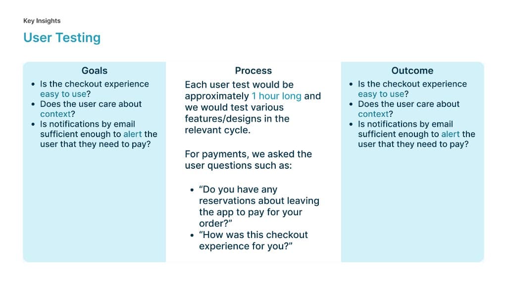
Actionable Insights
After usually a week of user testing, I would consolidate the feedback given and convert it into actionable insights. The way I did that was by identifying common pain points that users have mentioned or experienced in the test and start solutioning for how to improve on those experiences. Those improvements would take shape in the high-fi design process.
Actions taken based on user tests:
- Include a payment dynamic action bar on the home screen of the app
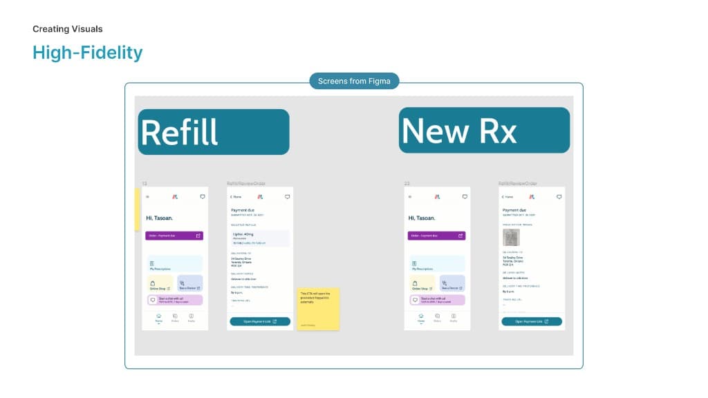
- Iterations of the payment due review screen for both refills and new prescription orders
Two dimensional product
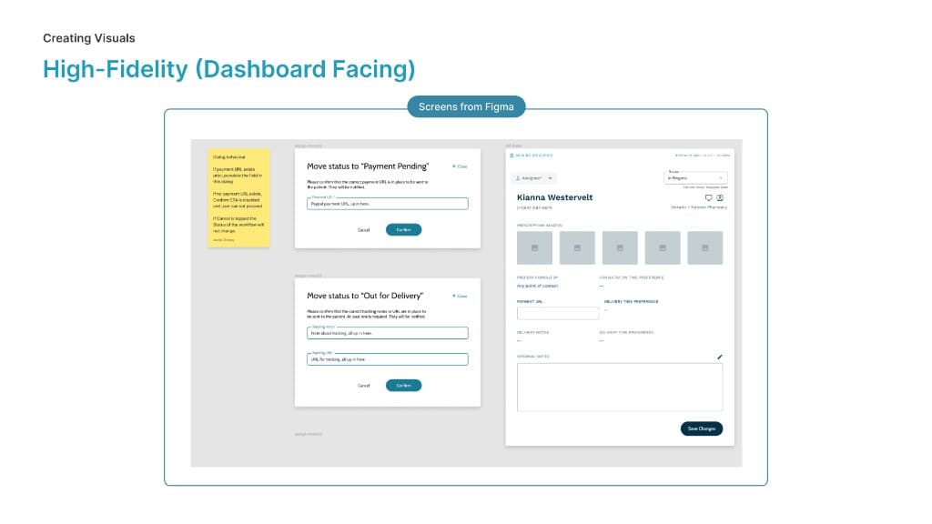
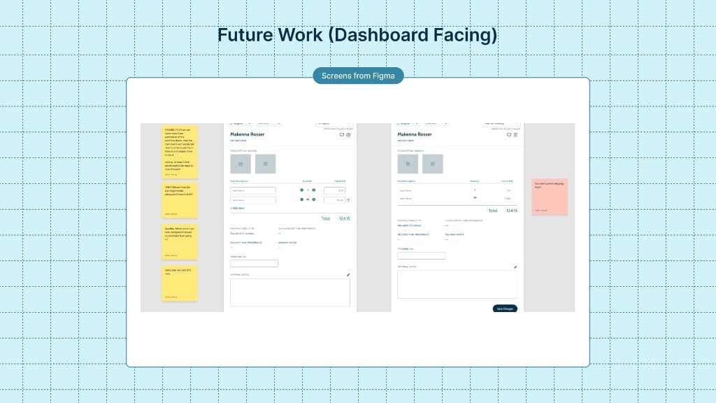
Whilst building the UX/UI of the mobile app, the design team would also be designing the dashboard features in parallel for our pharmacist team. So for example in this cycle for payment, we build out dashboard components that allow our team to fulfill the orders of our patients on the mobile side.
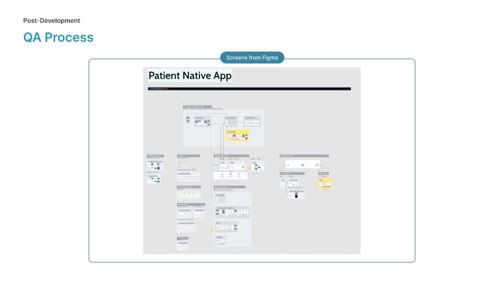
As our development team begins to release features into the testing environments, we (the design team) support our QA team by creating what we call a visual information architecture. Essentially it is a visual map of the entire product and its features, old features would be greyed out as seen below but net-new features would be high-lighted and would make it easy for our QA team to find the most up to date designs which speeds up their process.
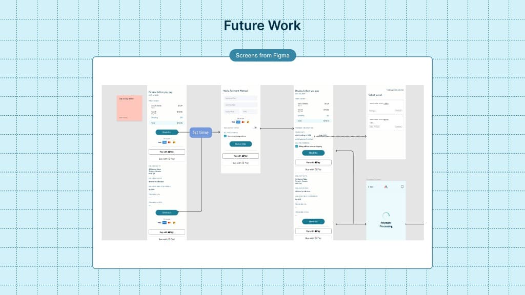
We understood as a product team that the feature we had built for this cycle was not an ideal experience in comparison to more conventional payment experiences. Due to our technology and time limitations however we believe we built a feature that met the needs of our stakeholders as an interim solution. It's important to plan ahead so below are some visuals of feature work the design team worked on in preparation for a cycle/sprint where we revisit the payment feature.
Thank You